Themes and Theming
| Status: | Draft |
|---|---|
| Version: | 1.2 |
Contents
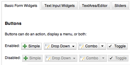
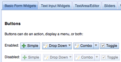
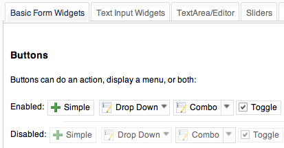
Dijit Themes lend a consistent look and feel to widgets. Dijit comes prepackaged with three themes, and users can write their own themes too.
Common Elements
If you look at /dijit/themes/tundra, you can see that a theme is just a bunch of CSS and images:
themes/
  tundra/
     tundra.css       <-- all the CSS for all the widgets
     images/
        checkbox.gif  <--- all the checkbox and radio button images
        fader.gif     <--- background image referenced by tundra.css
The icons are located in the images directory (along with background images) and are referenced from the widget via CSS rules (via the background-image property of a dummy node).
The tundra.css file has rules like:
.tundra .dojoButton { ... }
Theme Setup
To include a given theme on your page, include the themeName.css file: (one of tundra.css, nihilo.css, or soria.css)
<link rel="stylesheet" href="dojo/dijit/themes/tundra/tundra.css" />
Then add a theme name to the <body> element, like:
<body class="tundra">
note: The reason the tundra theme requires a class=tundra on the body tag (or some other tag) is because the rules all list a hierarchy like ".tundra .dojoButton". This is done to prevent the tundra class from affecting any of your page styles.
Icons
Many widgets take a parameter called iconClass to specify an icon. The idea is that the theme defines a CSS class loading the icon as a background-image.
For efficiency loading icons, themes tend to put multiple icons into one image file. For example, the Cut button with class "dijitEditorIconCut" has the following definition in Tundra.css:
.tundra .dijitEditorIcon
/* All of the selectors for the icons go here */
{
      background-image: url('images/editor.gif'); /* mega-image */
      background-repeat: no-repeat;
      width: 18px;
      height: 18px;
      text-align: center;
}
.tundra .dijitEditorIconCut { background-position: -108px; }
The CSS class(es) "dijitEditorIcon dijitEditorIconCut" indicate the cut icon.
The Cut icon starts 108 px from the right edge, and measures 18px by 18px. 108 equals 6 * 18, so it's the 6th image from the right. You can define your own buttons by setting up CSS selectors using code similar to the previous code, and wire up the iconClass.
Themes may even specify variations on an icon depending on state, such as a faded or black and white cut icon for when the cut function is disabled.
The special icon would be triggered by a rule like
.tundra .dijitDisabled .dijitEditorIcon {
   background-image: url('images/editorDisabled.gif');
}
Using multiple themes
Dijit includes Nihilo and Soria themes as well as Tundra. You will be able to include additional CSS files into your document, like:
<style type="text/css">
  @import "dojo/dijit/themes/nihilo/nihilo.css";
  @import "dojo/dojo/resources/dojo.css"
</style>
nihilo.css will define rules like:
.nihilo .dijitButton { ... }
so it won't conflict with tundra.css.
To have different sections of your document that are different themes, you just change the class of each section. For example, to make the main document tundra theme, but then have sections that are noir and soria theme, do:
<body class=tundra>
  ...
      <div dojoType="dijit.layout.TabContainer">
              <div dojoType="dijit.layout.ContentPane" label="Tab1" class="nihilo">
                      <input dojoType="dijit.form.TextBox">
                      <button dojoType="dijit.form.Button">Noir Button</button>
                      ...
              </div>
              <div dojoType="dijit.layout.ContentPane" label="Tab2" class="soria">
                      <input dojoType="dijit.form.TextBox">
                      <button dojoType="dijit.form.Button">Soria Button</button>
                      ...
              </div>
      </div>
  ...
</body>
All the widgets in the first tab will have the Noir theme and all the widgets in the second tab will have the Soria theme.
Overriding a theme
You can also define a variation on a theme (much like Handel). Let's say that you like the tundra theme but for each tab above, just want to change the background color of the form widgets. You would define yellowForm and blueForm to just change the background color:
.yellowForm .dijitButton, .yellowForm .dijitInputField { background-color: yellow; }
.blueForm .dijitButton, .blueForm .dijitInputField { background-color: blue; }
Then you would reference the override class in a similar way to above:
<div dojoType="dijit.layout.TabContainer">
      <div dojoType="dijit.layout.ContentPane" label="Tab1" class="yellowForm">
              <input dojoType="dijit.form.TextBox">
              <button dojoType="dijit.form.Button">Yellow Button</button>
              ...
      </div>
      <div dojoType="dijit.layout.ContentPane" label="Tab2" class="blueForm">
              <input dojoType="dijit.form.TextBox">
              <button dojoType="dijit.form.Button">Blue Button</button>
              ...
      </div>
</div>
The two tabs would then be tundra theme except for the background color on form fields
Writing Your Own Theme
If you want to develop your own theme just make rules like
.myTheme .dojoButton { ... }
and include them into your page.
The dijit.form.Checkbox widget displays the checkbox image using an <img> tag. However, it grabs the image location from the CSS.
The class names used on widgets do not change based on the theme, although they will change based on the state of the widget. For example, an input field will have class="dojoInputField", but a disabled input field will have class= "dojoInputField dojoInputFieldDisabled"
Applying style directly to a widget
You can apply styles to plain dom nodes in various ways:
<div style="margin: 30px;">...</div>
or
<style>
   #xyz { margin: 30px; }
</style>
<div id="xyz">...</div>
or
<style>
 .myClass { margin: 30px; }
</style>
<div class="myClass">...</div>
The first two techniques should work for widgets also. However, the third technique is not likely to work, because some of style rules like ".tundra .dojoButton", will take precendence.